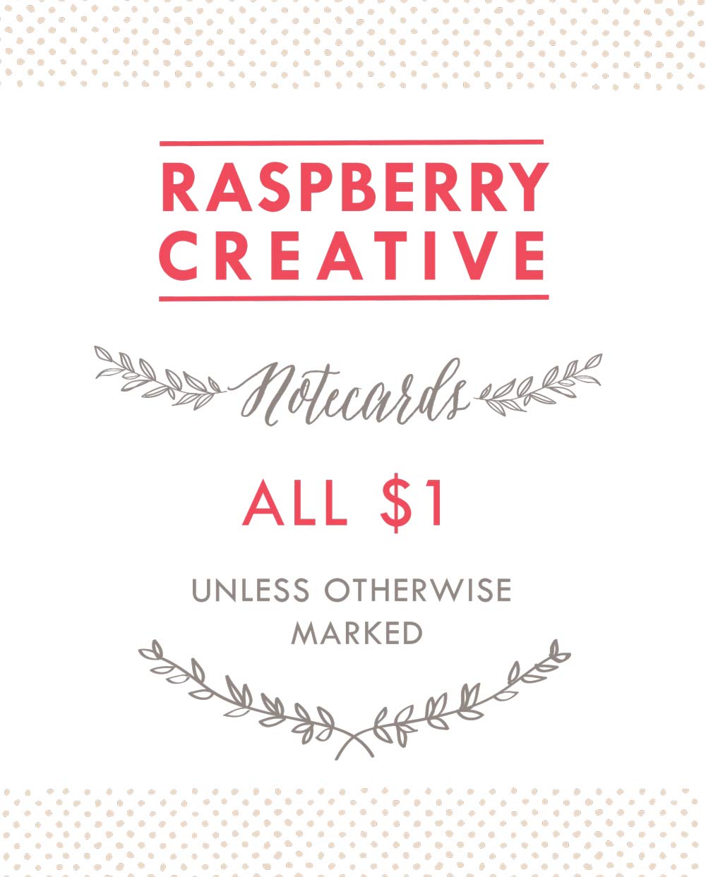
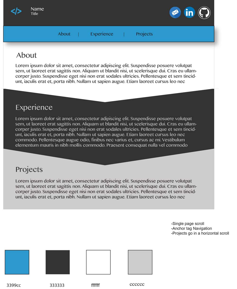
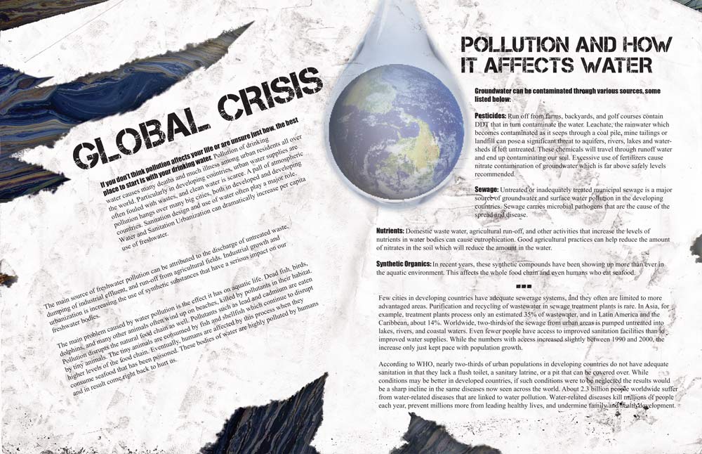
Hi, I'm Rachel; I explore and create innovative and unique designs that communicate your message.

Graphic Design

Graphic Design


Creating captivating designs from a blank canvas, allowing me to meet your needs.
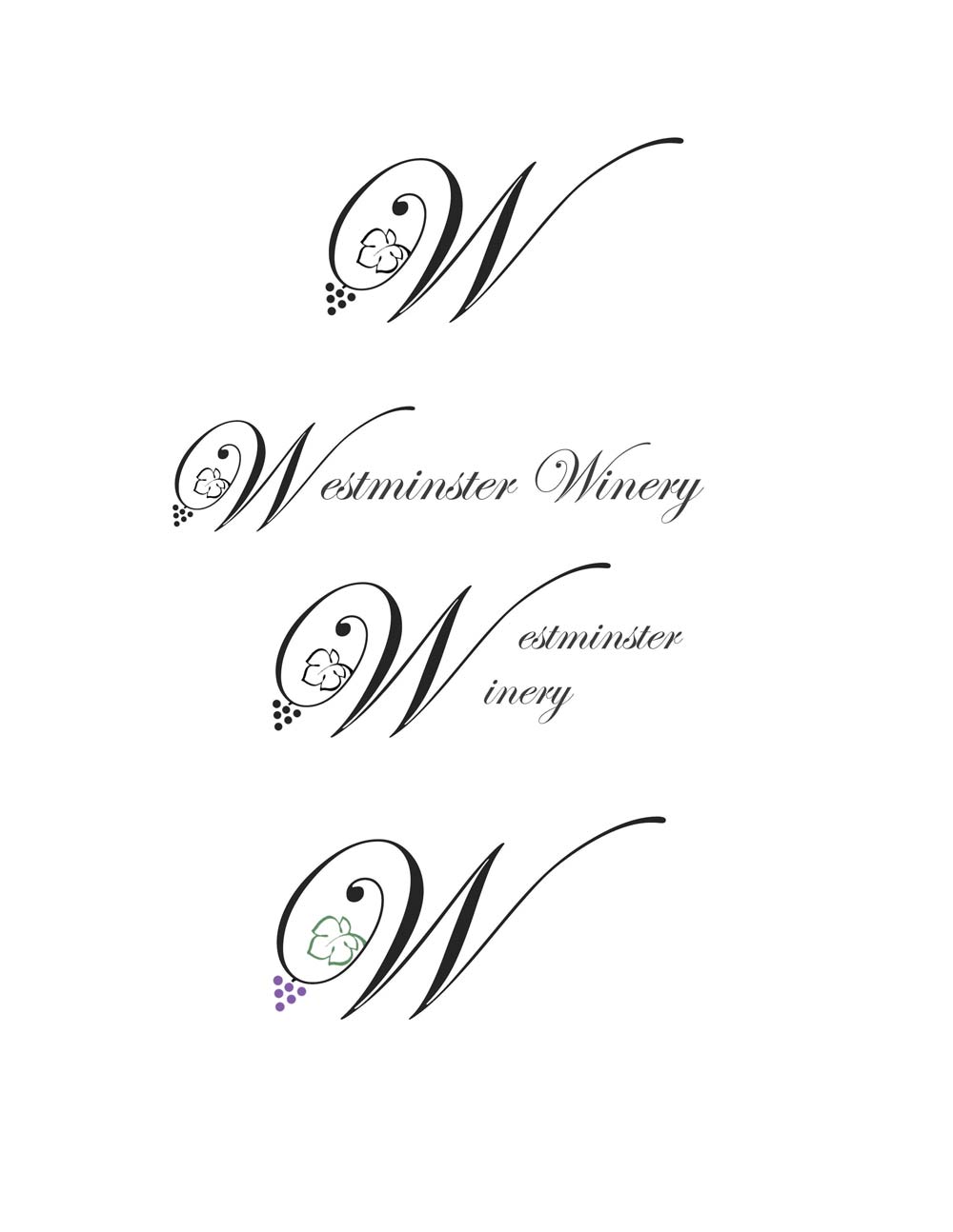
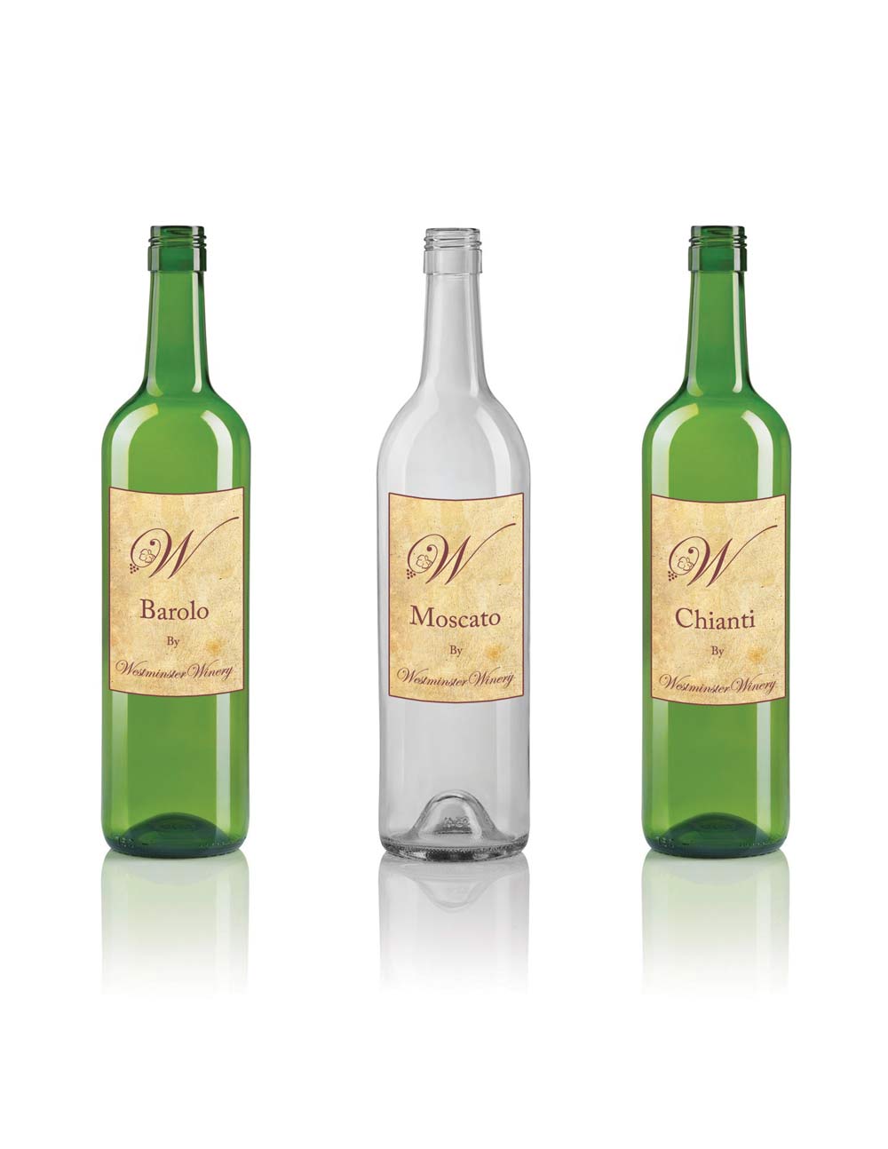
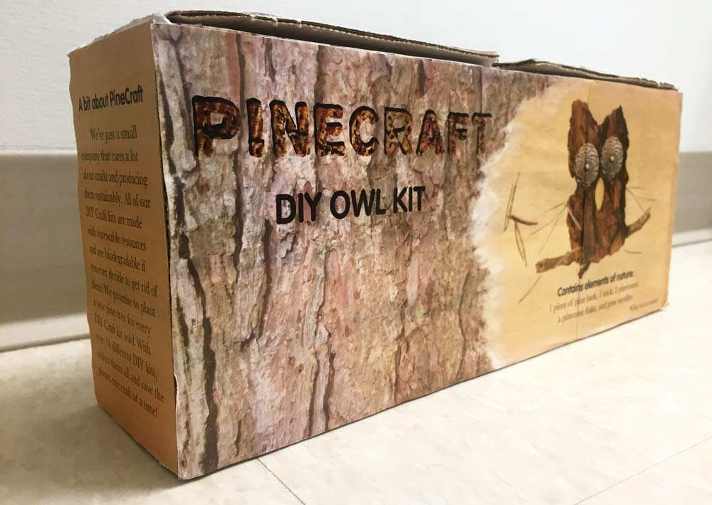
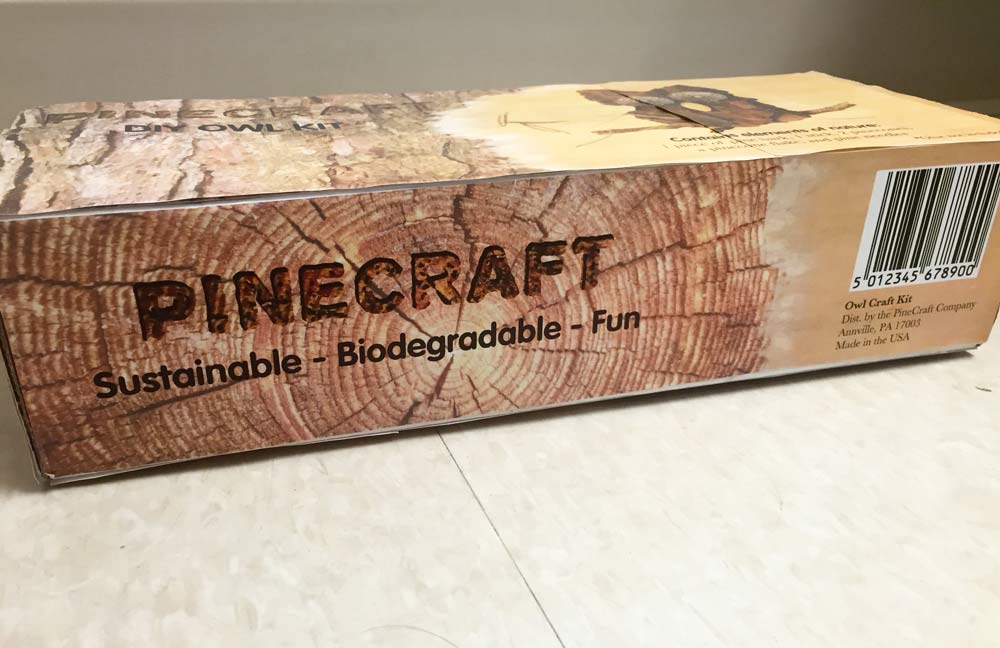
Package Design

Product Design


Ensuring your product looks outstanding in its market.

Marketing

Marketing


Increasing awareness and sales of your product.
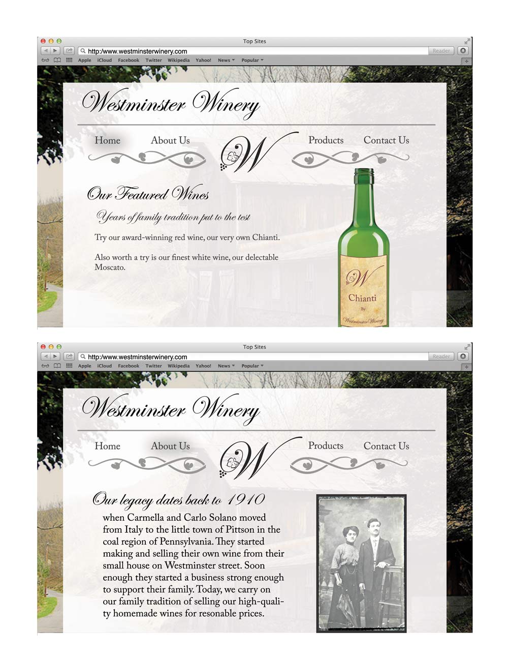
Communications

Communications


Conveying your message and telling your story though publications and social media.

About Rachel Sautner

I recently graduated Cum Laude from Lebanon Valley College with a BS in Digital Communications, a Concentration in Communications, and a Minor in Music. Digital Communications is a program that provided me with experience in the interrelated fields of design, business, communications, programming, and User Experience, and developed the critical thinking and problem solving skills that I need in the ever-changing field of technology.

As a Communications concentration, I love to explore how the integration of these skills allows me to convey any sort of message or idea, and to practice these skills through classwork, career opportunities, freelance projects,and pieces I make for myself.

Get In Touch

Rachel Sautner

Also Find Me On

I designed this poster to promote Allegiance, a new musical that revolves around the Japanese internment camps in America during WWII. This project's guidelines requrired me to hand render around 70% of the elements and arrange and edit them digitally. I tea-stained an American flag, photographed my colleague and digitally traced his silhouette, painted the background in the silhouette with watercolor, and ripped and stained the papers in the top and bottom of the design. I chose to destruct the American flag to represent this shameful era in Amrican history. I designed a dark, muddled pattern for the silhouette to represent the despair and stress the Japanese Americans must have felt. I added barbed wire to symbolize the internment camps and chose a script font to offset the grunginess of the overall design.

While working at Innocor, I facilitated a collaboration with WNEP, the Northeastern Pennsylvania News Station, to film a segment of the morning show Leckey Live. I maintained contact with WNEP staff regarding the event, set up the staging area with Innocor's neatest props (mattresses, eggcrate, etc.) and helped WNEP highlight their most exciting processes (pouring foam, etc.) WNEP aired 5 live 2-minute segments in the morning from approximately 4:30- 6:45, and a pre-recorded session at noon. You can view a few of these segments here.

Here are note cards, for any occasion, that I illustrated and rendered in Adobe Photoshop for my job at Raspberry Creative. I also designed the packaging to be simplistic, yet still retain the Raspberry Creative style and branding.

This is the packaging I designed to go on Raspberry Creative's homemade soy candles. I designed the lid and the underside of the candle containers to be inviting and colorful while adhering to Raspberry Creative's style guides and branding.

Karin Suzuragi is the Mangaka, or manga artist that illustrated the book series Higurashi When They Cry. I created this poster for a class using Adobe Photoshop and Illustrator to show off Suzuragi's talent and promote her as an artist. This piece communicates Suzuragi's style and compells audiences to investigate further.

These are posters I designed for my company Raspberry Creative's table at MayFest, a street fair and festival held annually in Mifflinburg, Pennsylvania. These signs advertise the company's merchandise and entice customers to inquire about its services, will adhering to Raspberry Creative's branding.

These are posters I designed for my company Raspberry Creative's table at MayFest, a street fair and festival held annually in Mifflinburg, Pennsylvania. These signs advertise the company's merchandise and entice customers to inquire about its services, will adhering to Raspberry Creative's branding.

These are posters I designed for my company Raspberry Creative's table at MayFest, a street fair and festival held annually in Mifflinburg, Pennsylvania. These signs advertise the company's merchandise and entice customers to inquire about its services, will adhering to Raspberry Creative's branding.

These are posters I designed for my company Raspberry Creative's table at MayFest, a street fair and festival held annually in Mifflinburg, Pennsylvania. These signs advertise the company's merchandise and entice customers to inquire about its services, will adhering to Raspberry Creative's branding.

Westminster Winery is a fictional brand I created for an academic project. The company I created would be based out of Pittston, Pennsylvania on Westminster Road, hence the name. The company would need some simple, yet elegant branding to create an identity with the locals, and eventually the Northeast. In this packet, I created variations of the logo, both black and white and color, lables for different wine bottles, and detailed wireframes of the website.

Westminster Winery is a fictional brand I created for an academic project. The company I created would be based out of Pittston, Pennsylvania on Westminster Road, hence the name. The company would need some simple, yet elegant branding to create an identity with the locals, and eventually the Northeast. In this packet, I created variations of the logo, both black and white and color, lables for different wine bottles, and detailed wireframes of the website.

Westminster Winery is a fictional brand I created for an academic project. The company I created would be based out of Pittston, Pennsylvania on Westminster Road, hence the name. The company would need some simple, yet elegant branding to create an identity with the locals, and eventually the Northeast. In this packet, I created variations of the logo, both black and white and color, lables for different wine bottles, and detailed wireframes of the website.

I took on a new project for a family in a pinch who did not have time to get professional Christmas photos taken, but wanted something sentimental to send to relatives. We improvised and used their most recent beach pictures to create something reminiscent of warm weather, but still festive.

For this project, I had to create my own brand for a beverage and design the packaging for a 4 pack. I chose to go with a witchy theme based off of the idea of brewing beer and my personal preference of horror/ grunge design. The alliteration motif appears in the name of each of these beers; Effervescent Elixir, Ethereal Elixir, Efflorescent Elixir, and Evocative Elixir. Historically, the Witching Hour is the occult belief that refers to the time at which creatures, such as witches, demons, and ghosts are thought to appear and to be at their most powerful. Black magic is thought to be most effective at this time. The period lasts from 3 AM to 4 AM, when there are no Catholic church services and prayers, as marked by the Canonical hours. The lore on the back label of these beers alludes to the idea of demons becoming active at 3:00 am, which can be faintly seen on the moon logo. I deliberately chose the shape of these bottles, as I found them unique and thought they looked like they would contain potion. Additionally, I tied the neck labels on with twine and corked the bottles instead of capping them to stick with my unique and witchy theme.

For this project, I had to create my own brand for a beverage and design the packaging for a 4 pack. I chose to go with a witchy theme based off of the idea of brewing beer and my personal preference of horror/ grunge design. The alliteration motif appears in the name of each of these beers; Effervescent Elixir, Ethereal Elixir, Efflorescent Elixir, and Evocative Elixir. Historically, the Witching Hour is the occult belief that refers to the time at which creatures, such as witches, demons, and ghosts are thought to appear and to be at their most powerful. Black magic is thought to be most effective at this time. The period lasts from 3 AM to 4 AM, when there are no Catholic church services and prayers, as marked by the Canonical hours. The lore on the back label of these beers alludes to the idea of demons becoming active at 3:00 am, which can be faintly seen on the moon logo. I deliberately chose the shape of these bottles, as I found them unique and thought they looked like they would contain potion. Additionally, I tied the neck labels on with twine and corked the bottles instead of capping them to stick with my unique and witchy theme.

For this project, I had to create my own brand for a beverage and design the packaging for a 4 pack. I chose to go with a witchy theme based off of the idea of brewing beer and my personal preference of horror/ grunge design. The alliteration motif appears in the name of each of these beers; Effervescent Elixir, Ethereal Elixir, Efflorescent Elixir, and Evocative Elixir. Historically, the Witching Hour is the occult belief that refers to the time at which creatures, such as witches, demons, and ghosts are thought to appear and to be at their most powerful. Black magic is thought to be most effective at this time. The period lasts from 3 AM to 4 AM, when there are no Catholic church services and prayers, as marked by the Canonical hours. The lore on the back label of these beers alludes to the idea of demons becoming active at 3:00 am, which can be faintly seen on the moon logo. I deliberately chose the shape of these bottles, as I found them unique and thought they looked like they would contain potion. Additionally, I tied the neck labels on with twine and corked the bottles instead of capping them to stick with my unique and witchy theme.

For this project, I had to create my own brand for a beverage and design the packaging for a 4 pack. I chose to go with a witchy theme based off of the idea of brewing beer and my personal preference of horror/ grunge design. The alliteration motif appears in the name of each of these beers; Effervescent Elixir, Ethereal Elixir, Efflorescent Elixir, and Evocative Elixir. Historically, the Witching Hour is the occult belief that refers to the time at which creatures, such as witches, demons, and ghosts are thought to appear and to be at their most powerful. Black magic is thought to be most effective at this time. The period lasts from 3 AM to 4 AM, when there are no Catholic church services and prayers, as marked by the Canonical hours. The lore on the back label of these beers alludes to the idea of demons becoming active at 3:00 am, which can be faintly seen on the moon logo. I deliberately chose the shape of these bottles, as I found them unique and thought they looked like they would contain potion. Additionally, I tied the neck labels on with twine and corked the bottles instead of capping them to stick with my unique and witchy theme.

For this project, I had to create my own brand for a beverage and design the packaging for a 4 pack. I chose to go with a witchy theme based off of the idea of brewing beer and my personal preference of horror/ grunge design. The alliteration motif appears in the name of each of these beers; Effervescent Elixir, Ethereal Elixir, Efflorescent Elixir, and Evocative Elixir. Historically, the Witching Hour is the occult belief that refers to the time at which creatures, such as witches, demons, and ghosts are thought to appear and to be at their most powerful. Black magic is thought to be most effective at this time. The period lasts from 3 AM to 4 AM, when there are no Catholic church services and prayers, as marked by the Canonical hours. The lore on the back label of these beers alludes to the idea of demons becoming active at 3:00 am, which can be faintly seen on the moon logo. I deliberately chose the shape of these bottles, as I found them unique and thought they looked like they would contain potion. Additionally, I tied the neck labels on with twine and corked the bottles instead of capping them to stick with my unique and witchy theme.

In my time at Raspberry Creative, I designed wedding stationery, such as the example provided here. This was stationery designed for a "Beach Getaway" themed wedding. The color palatte is designed to emulate the idyllic scenery one envisions when they picture a wedding placed on a coastal shoreline.

DIY July is a Co-op blog series I worked on with my employer during July of 2014. The purpose of this blog was to present brides with fun Do-It-Yourself projects to save money at their weddings, while promoting the innovative talents at Raspberry Creative. The photography and projects featured in this series were all executed by me.

In addition to my own, I have designed several wireframes for others' portfolio webpages. I have worked with clients in fields different from my own, and have adapted the designs to afford their skills and content. To see this particular design in action, click here.

I found an article online regarding the danger of water pollution, so I designed two adjacent magazine pages to accentuate the message of the article. The dirtiness of the paper over the oil slick pattern background visually reinforces the idea of pollution, and the grungy fonts command attention while working into the overall design. The tears in the paper and the angled text on the left page ""attack"" the organic water drop design, and show that the earth has literally been turned upside down by destructive human activity.

I found an article online regarding the danger of water pollution, so I designed two adjacent magazine pages to accentuate the message of the article. The dirtiness of the paper over the oil slick pattern background visually reinforces the idea of pollution, and the grungy fonts command attention while working into the overall design. The tears in the paper and the angled text on the left page ""attack"" the organic water drop design, and show that the earth has literally been turned upside down by destructive human activity.

My task was to design a package for selling content that people can acquire for free. In this case, I designed an Owl Craft Kit that contains pine needles, a piece of bark, pinecones, and a stick. The package shows a 3-step tutorial on how to put the craft together, but it does not, however, contain the glue needed to assemble it. I market the craft as fun and biodegradable, so when customers buy other craft kits, they save the planet one craft at a time.

My task was to design a package for selling content that people can acquire for free. In this case, I designed an Owl Craft Kit that contains pine needles, a piece of bark, pinecones, and a stick. The package shows a 3-step tutorial on how to put the craft together, but it does not, however, contain the glue needed to assemble it. I market the craft as fun and biodegradable, so when customers buy other craft kits, they save the planet one craft at a time.

My task was to design a package for selling content that people can acquire for free. In this case, I designed an Owl Craft Kit that contains pine needles, a piece of bark, pinecones, and a stick. The package shows a 3-step tutorial on how to put the craft together, but it does not, however, contain the glue needed to assemble it. I market the craft as fun and biodegradable, so when customers buy other craft kits, they save the planet one craft at a time.

In my Usability Journal blog series, I apply User Experience principles to systems I encounter every day, and critique what elements make them either good or bad, all while maintaining an engaging tone. To read more posts in this blog series, click here.